Your small business’s website is more than just an online presence—it’s your brand’s digital flagship. Crafting a website that stands out requires attention to detail, strategic design, and a deep understanding of your audience’s needs. To make certain that you’re offering something more than brochure-ware, here are the Top 5 attributes of an effective small business website.
1. User-Friendly Design
Why It’s Important: A website with a user-friendly design provides an intuitive and satisfying experience for your visitors. It means your website loads quickly, looks great on all devices, and has a logical navigation structure that makes finding information simple and straightforward.
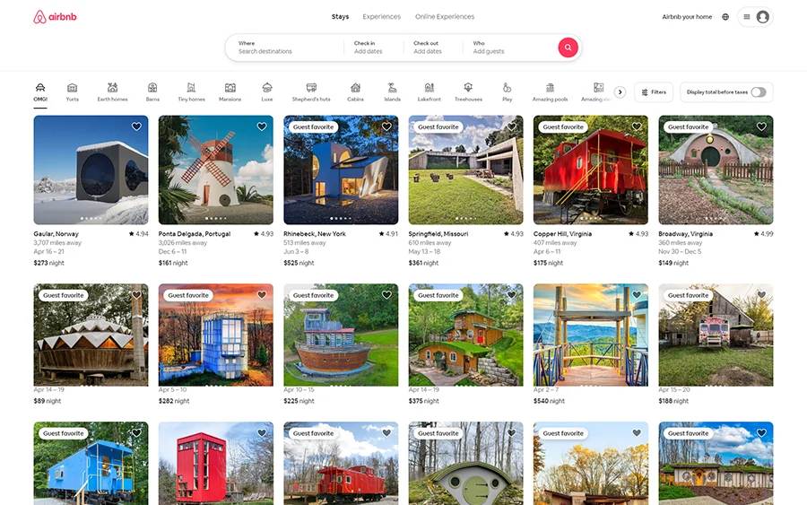
Real Examples: Both the Airbnb and Warby Parker websites emphasize clarity, speed, and ease of navigation, ensuring users can find what they need without frustration.
Airbnb (airbnb.com) offers an exemplary user experience with its simple, intuitive search and booking process.
Warby Parker (warbyparker.com) showcases a mobile-responsive design that makes shopping for eyewear online a breeze, emphasizing ease of use and accessibility.
2. Clear and Concise Content
Why It’s Important: Your website’s content should quickly and efficiently convey your value proposition. Visitors should understand what you offer and why it matters to them without wading through dense text or industry jargon.
Real Examples: These examples show how effective websites use content to educate, engage, and convert visitors by presenting information in an accessible way.
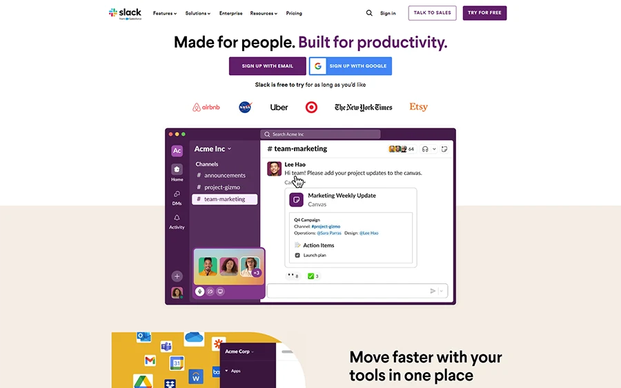
Slack (slack.com) communicates its benefits through concise, engaging copy and helpful visuals that explain how the tool simplifies communication.
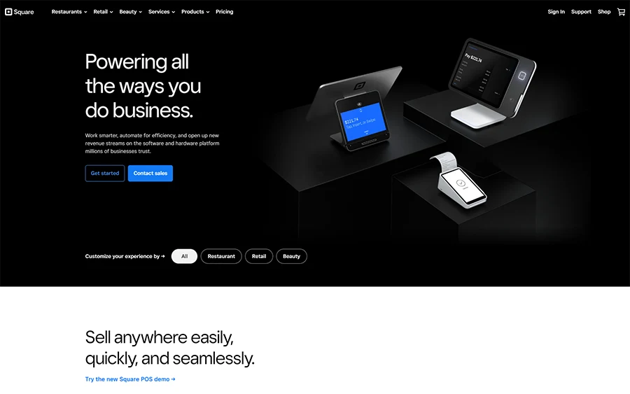
Square (squareup.com) uses straightforward language and clear headings to outline its payment processing solutions, making complex information easily digestible for small business owners.
3. Strong Call To Action
Why It’s Important: CTAs guide your users toward your desired action, be it subscribing to a newsletter, requesting more information, or making a purchase. They are the signposts that direct user engagement on your site.
Real Examples: These sites excel in converting visitors to action-takers through well-placed, persuasive CTAs that align with user intent.
Netflix (netflix.com) uses a prominent, persuasive CTA inviting users to start a free trial, making it almost irresistible not to click.
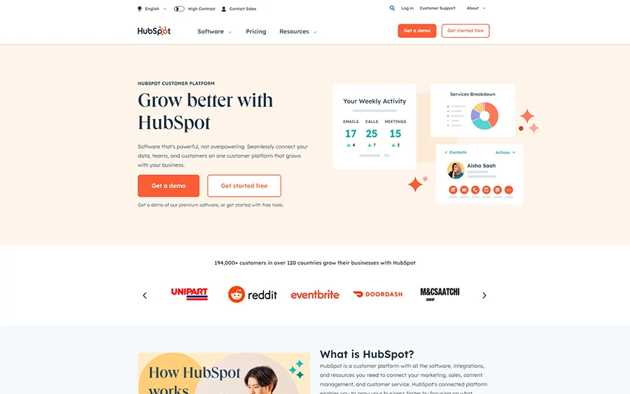
HubSpot (hubspot.com) features multiple clear and compelling CTAs across its homepage, tailored to different stages of the buyer’s journey, from learning more about products to requesting a demo.
4. Trust Signals
Why It’s Important: Trust signals, such as customer testimonials, industry certifications, and media mentions, build credibility and reassure visitors of your legitimacy and quality.
Real Examples: Incorporating these elements can significantly enhance trust in your brand, encouraging visitors to engage with your business with confidence.
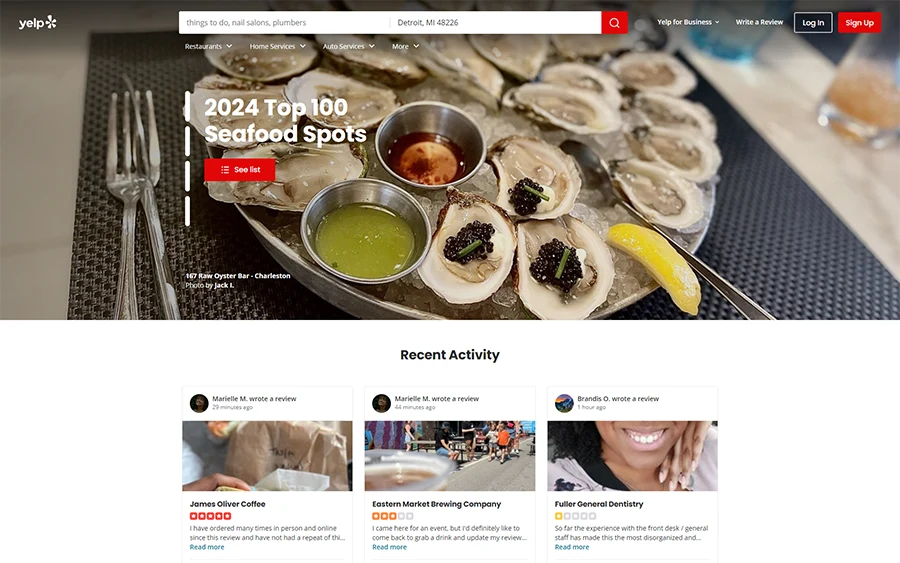
Yelp (yelp.com) leverages user reviews to build trust with new visitors, showcasing the experiences of real customers.
Shopify (shopify.com) displays logos of well-known brands that use their platform, alongside testimonials from satisfied customers, to underscore its reliability and performance.
5. Search Engine Optimization (SEO)
Why It’s Important: SEO practices improve your site’s visibility in search engine results, attracting more traffic. This includes optimizing content for relevant keywords, ensuring your site is mobile-friendly, and improving site speed.
Real Examples: Effective SEO strategies ensure that your business gets found by the right people at the right time, driving organic traffic to your site.
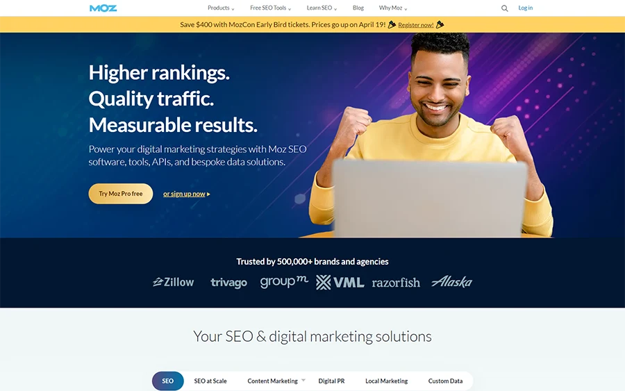
Moz (moz.com), as mentioned, not only provides SEO tools but also ranks highly for competitive keywords, thanks to its comprehensive SEO strategy.
Etsy (etsy.com) excels in SEO by optimizing product listings and content for long-tail keywords, making it easy for customers to find unique items through search engines.
Maintaining Your Website’s Vitality
A dynamic website is a successful one. Regularly updating your website—ideally, on a quarterly basis—ensures that content remains fresh, relevant, and engaging. Additionally, plan for a more significant overhaul every two to three years to adapt to technological advancements and evolving user expectations. This proactive approach keeps your site competitive and in line with best practices.
Dynamic Edge Can Help
Since 1999, Dynamic Edge has helped hundreds of small and mid-sized businesses maximize the return on their technology investment. Our graphic designers create effective websites that power our small business clients. Contact us today for a free network assessment, so that we may help you implement cost-effective security solutions to keep your organization and its clients safe and productive. Our Help Desk features friendly, experienced engineers who answer calls live and solve more than 70% of issues on the first call.
